
When the feminists are not busy vilifying men and presenting women as their perpetual victims, they are indulging in self-glorification instead.
Yesterday The Guardian ran a story titled, “Female-led countries handled coronavirus better, study suggests”. They linked to this study by Supriya Garikipati and Uma Kambhampati at the universities of Liverpool and Reading respectively.
The Guardian describes the study as “published by the Centre for Economic Policy Research and the World Economic Forum”, which I interpret as meaning those bodies funded the work. However, it is published by SSRN (Social Science Research Network) which is a preprint repository – in other words, it is not a peer reviewed journal paper. The conclusions of the study claim that,
“Our findings show that COVID-outcomes are systematically and significantly better in countries led by women and, to some extent, this may be explained by the proactive policy responses they adopted. Even accounting for institutional context and other controls, being female-led has provided countries with an advantage in the current crisis…..the gender of leadership could well have been key in the current context where attitudes to risk and empathy mattered as did clear and decisive communications……women leaders seem to have emerged highly successful.”
The Guardian article included this graphic,
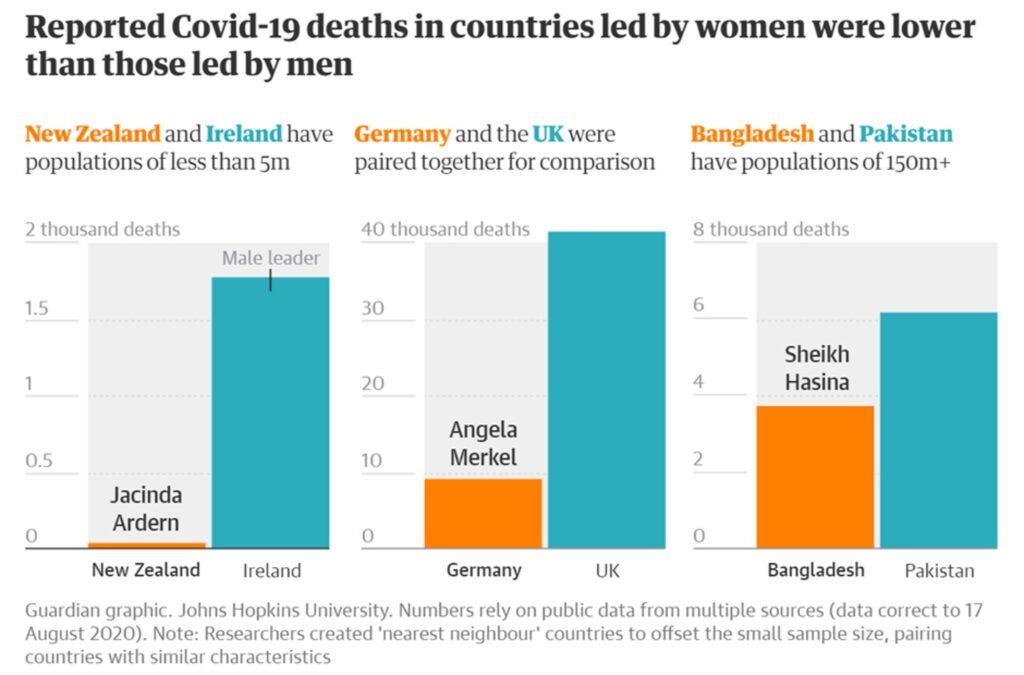
(It is not really that their geography has gone so awry as to believe that New Zealand and Ireland are literally ‘nearest neighbours’ – the term is used in a different sense, see below).
I have been keeping well away from Covid-19 statistics in general, other than the occasional reminder to the wilfully obtuse that male mortality is roughly double that for women. There are a number of reasons for my reticence in getting involved in Covid stats, one being that we have yet to see if the stats at present bear any relationship to the final out-turn in, say, a year or two’s time. Draconian lockdowns now may mean more deaths later – who knows. Another reason is that I have been sceptical about the value of the statistics, both of the numbers of cases and the numbers of deaths.
However, I couldn’t let Garikipati and Kambhampati’s study pass without examination, as I’m sure you will appreciate. I have analysed the data myself. As a by-product I find my previous scepticism in respect of the data to be justified.
In common with Garikipati and Kambhampati I take the Covid-19 data from Worldometer. Specifically, I took the data as they were on 19/8/20. Garikipati and Kambhampati’s data extended only up to 19/5/20, some three months less data than I have used. In both cases the data refer to cumulative quantities, i.e., cases, tests and deaths up to the date specified above.
Worldometer issues due warnings about the data. Data for total cases in a given country refer to the sum of confirmed cases and those that are merely suspected. However, as testing covers only a fraction, generally a tiny fraction, of populations, Worldometer warn that “most estimates have put the number of undetected cases at several multiples of detected cases”. In other words, no one really knows how many people have been infected with the virus in any given country (with a very few exceptions).
Total deaths are defined simply as the cumulative number of deaths among “detected” cases (noting that “detected” might mean a positive test result, or merely a suspected case). Hence the death data could be wildly too small or wildly too large. Since the death data is drawn only from detected cases, and since it is acknowledged that the number of people infected is probably “several multiples” larger, that potentially biases the death data down by a substantial factor. However, one might argue that this is less important than it appears because, where deaths occur, the case is likely to be counted as “detected”. In other words, those instances of infection which are not “detected” are likely to have extremely low mortality rates. Instead the death data may be over-estimated if large numbers of deaths within the “detected” cases are attributed to Covid-19 simply because the person was infected and died. In other words, how many people counted within the Covid dead actually died with the virus rather than of it?
On top of those major uncertainties, there are many reporting issues listed by Worldometer. Countries are constantly changing their methodology for reporting. Worldometer’s list of reporting issues seems not to be complete as the UK is not listed despite having recently revised down their death data. Finally, data collection and analysis is unlikely to be consistent between countries – and that is rather damning since the present exercise is precisely a comparison between countries.
However, my objective is not to draw any definitive conclusions based on the available Covid-19 statistics. My objective is only to examine the veracity of Garikipati and Kambhampati’s claims. The observations made above are already several nails hammered into the coffin lid. But the rest of my analysis asks what we find if we take the data at face value.
Firstly, let’s look at all the data without regard to the sex of the leaders. Worldometer lists 180 countries with Covid-19 data for all three of tests, cases and deaths. There are several more with data for some but not all these quantities, a total of 210 locations being listed. I use all the data available in what follows.
I confine attention to the following data: (i) tests per million of the country’s population, (ii) cases per million population, and, (iii) deaths per million population. Comparison between countries would be meaningless unless data per million of the population were used. Henceforth I may fail to stipulate “per million” for brevity, but this is to be understood throughout.
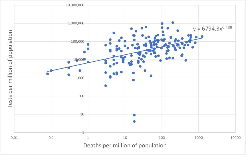
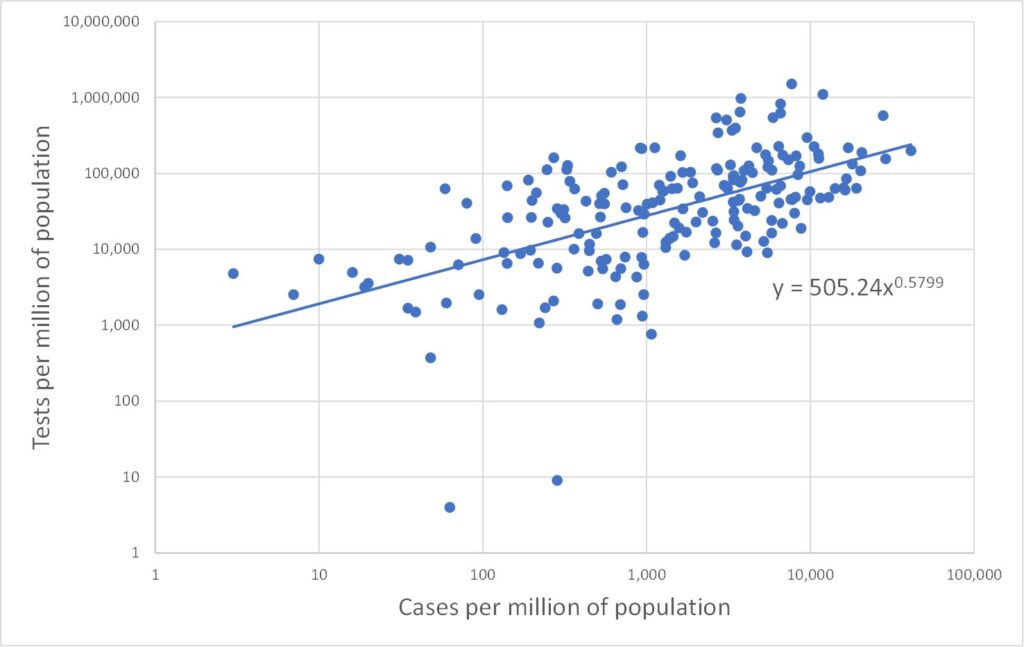
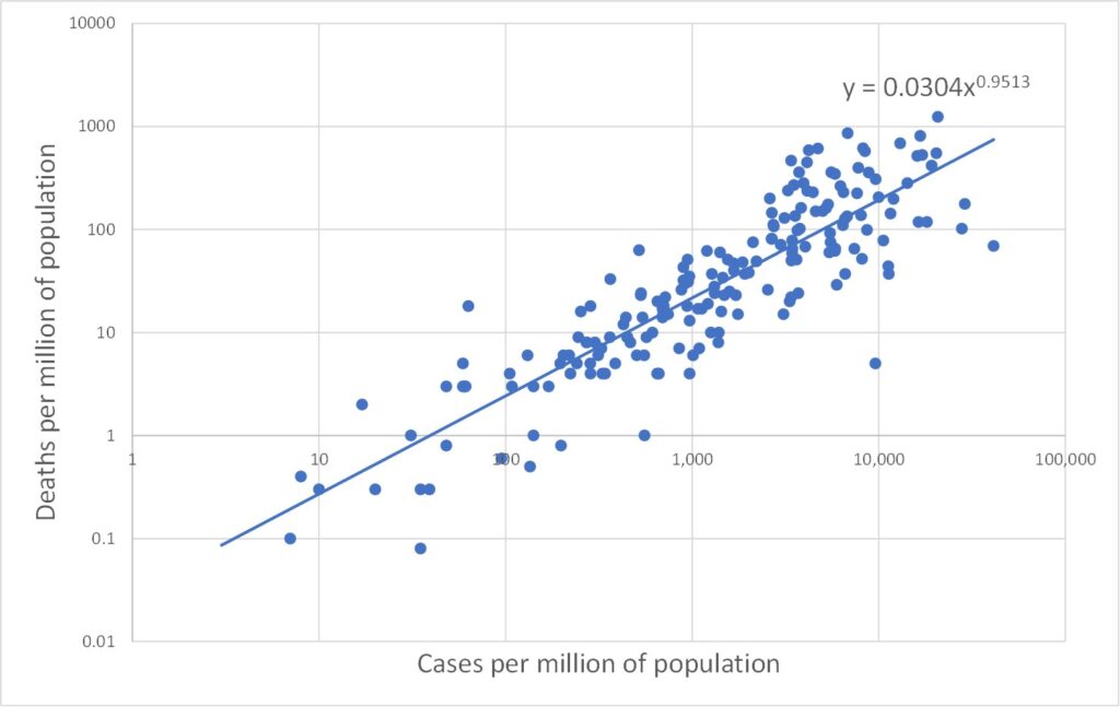
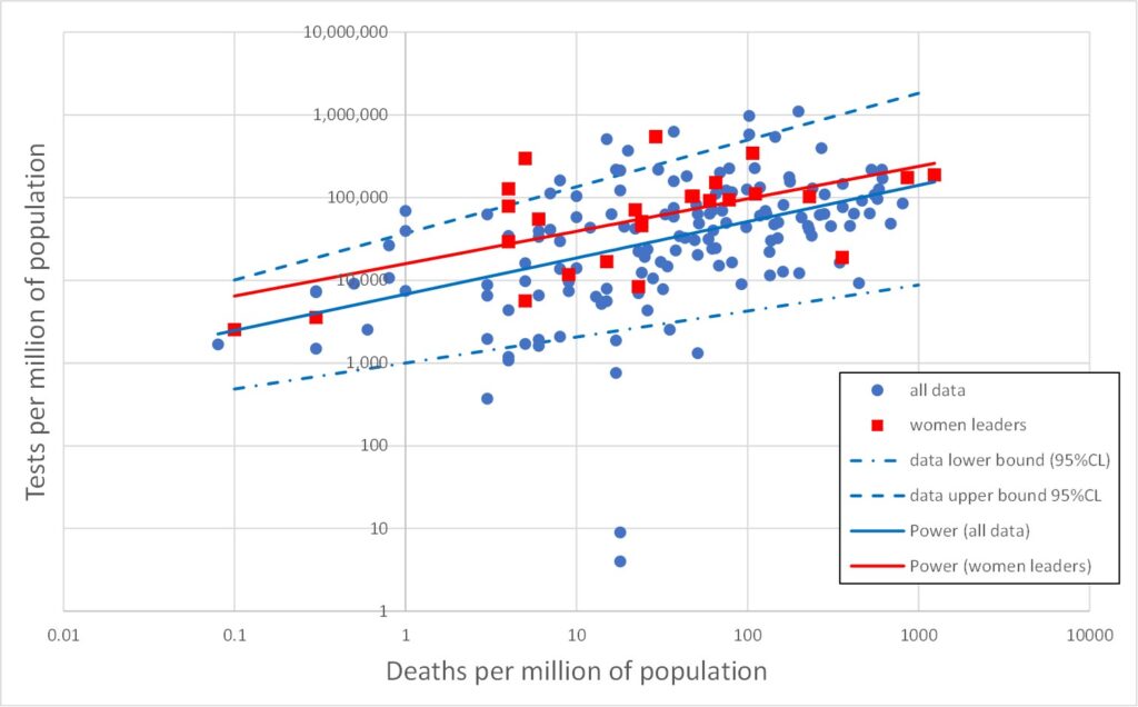
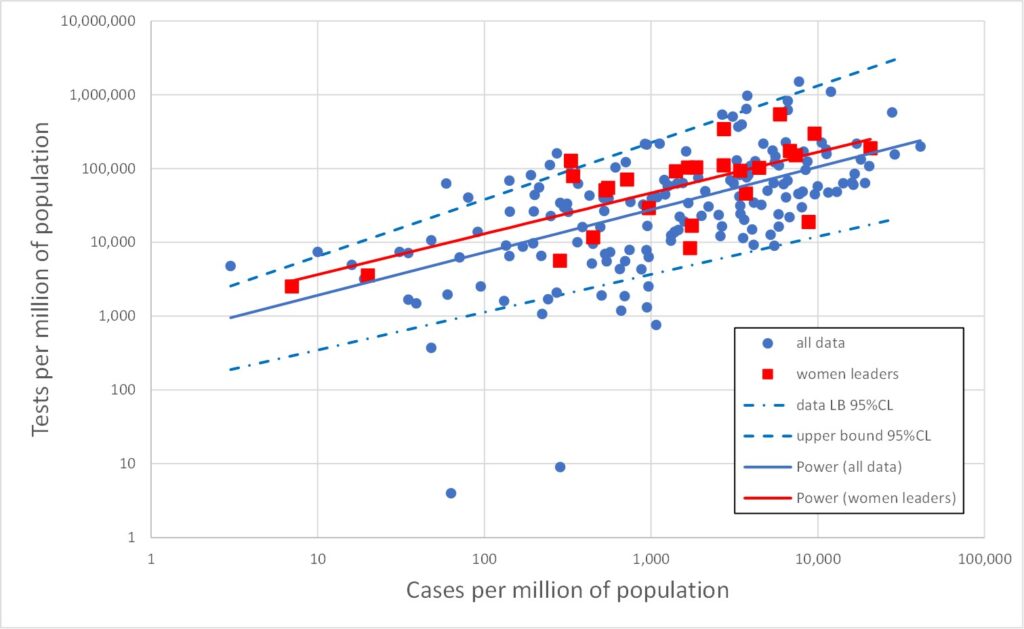
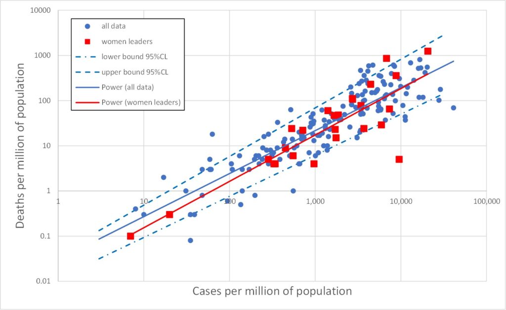
All three data types (tests, cases and deaths) range over several orders of magnitude. In such cases it is often more enlightening to plot data on log scales. This is done in Figures 2, 3 and 4 which plot on log scales: tests versus deaths, tests versus cases, and deaths versus cases respectively. Each graph also shows a best-fit line through the log-log data. A straight line on a log-log plot is actually a power law relationship between the variables, and the equation of this best-fit power law is given on the graphs. It is clear from the graphs that the log-quantities are correlated. The Pearson correlations of the log data are 0.47, 0.58 and 0.88 respectively.
Least surprising is Figure 4 in which the power law index is close to 1, indicating that the number of deaths is proportional to the number of cases, as one would expect. Note that this says nothing about the accuracy of either the death data or the cases data. Both could be wrong by some factor – and the factor could be different for deaths and cases – but proportionality would still be found if these factors were broadly the same between countries.
Figure 2 is more unexpected, indicating an association between the number of deaths and the number of tests. I think we can be confident the tests are not killing people, so how does this association arise? One possibility is that, as the number of deaths increases in a given country, so that country may be motivated to carry out a larger number of tests. But another possibility relates to the shortcomings of the death data as a true measure of Covid deaths. The death data are obtained simply as the numbers of deaths amongst those identified as cases (i.e., infected). The more tests that are done, the more cases (infections) will be found, and hence, inevitably, the larger will be the associated numbers of deaths as these will be drawn from an increased pool of candidates. The people in question may not have died from Covid-19, and this method of counting excludes valid Covid deaths outside the pool of identified cases.
There is a third possible contribution to the explanation of Figure 2 which relates to the time dimension. Recall that these data are cumulative over the whole Covid-19 pandemic period (perhaps 5 or 6 months or so). Over this period the number of deaths and the number of tests would increase from an initial zero. Moreover, different countries experienced the wave of infections and deaths at staggered time intervals. Hence, the data for a range of countries may be an alias for a range of times.
Figure 3 is initially even more odd. It is tempting to regard an association between cases and tests as telling us something about the efficacy of the testing regime. But Figure 3 makes no sense on that basis. Suppose tests were carried out at random. The number of cases detected would increase in proportion to the number of tests. But Figure 3 has a power law index of only 0.58, well below the value of unity expected for proportionality. On the other hand, suppose the testing regime was extremely efficiently targeted on the most likely to be infected, and only later tested other people. Again a linear relationship would be expected initially, until all the infected people had been tested and thereafter there would be no further increase in the number of cases. The trend of Figure 3 would then be a linear dependency which ultimately turns to the vertical – and this bears no similarity with the data at all.
To drive home how odd Figure 3 is, consider the trend line: carrying out 2,000 tests would reveal 10 infections (one in 200), whereas carrying out 100,000 tests would reveal 10,000 infections (one in ten). Why should the proportion of tests which are positive increase as the number of tests increases? One possible explanation again appeals to the time element. This is not a static picture. Carrying out a very large number of tests takes time, and hence will inevitably involve many tests carried out late in the pandemic. If the infection has continued to spread, regardless of lockdown measures, then there would indeed be a larger percentage of tests which return positive results later in the testing programme.
Note also that we only need explain either Figure 2 or Figure 3 since they are not independent. Any two of the power law behaviours of Figures 2, 3 and 4 may be used to derive the third as a matter of consistency.
In summary, the unexpected nature of the relationships evident in Figures 2 and 3, and the lack of a clear explanation for these behaviours, indicates that the data measures themselves (cases and deaths) are not properly understood and do not mean what they are naively promoted to mean.
[The sharp-eyed reader may have spotted a couple of data points in which the number of tests per million exceeds a million! These are correct – or, at least, what the Worldometer data states – and relate to the Faeroe Islands and Luxembourg whose populations of 49,000 and 627,000 have been tested more than once on average].
Now let’s return to examining the claims of Garikipati and Kambhampati.
The following lists countries in which the most powerful executive politician is female. This is clear in 17 cases. I have listed a further 9, making 26 in all, in which a woman is president to a male prime minister. The UK is listed in the Worldometer data as UK, not as four separate nations, so you won’t find Nicola Sturgeon below.
- Bangladesh Prime Minister – Sheikh Hasina
- Barbados Prime Minister – Mia Mottley
- Belgium Prime Minister – Sophie Wilmès
- Bolivia Interim President – Jeanine Áñez
- Denmark Prime Minister – Mette Frederiksen
- Estonia President – Kersti Kaljulaid
- Ethiopia President – Sahle-Work Zewde
- Finland Prime Minister – Sanna Marin
- Gabon Prime Minister – Rose Christiane Raponda
- Georgia President – Salome Zourabichvili
- Germany Federal Chancellor – Angela Merkel
- Greece President – Katerina Sakellaropoulou
- Iceland Prime Minister – Katrín Jakobsdóttir
- Myanmar State Counsellor – Aung San Suu Kyi
- Namibia Prime Minister – Saara Kuugongelwa
- Nepal President – Bidhya Devi Bhandari
- New Zealand Prime Minister – Jacinda Ardern
- Norway Prime Minister – Erna Solberg
- San Marino Captain Regent – Grazia Zafferani (jointly held post)
- Serbia Prime Minister – Ana Brnabić
- Singapore President – Halimah Yacob
- Slovakia President – Zuzana Čaputová
- Switzerland President of Federal Council – Simonetta Sommaruga
- Trinidada & Tobago President – Paula-Mae Weekes
- Taiwan President – Tsai Ing-wen
- Belarus President-elect – Sviatlana Tsikhanouskaya (disputed legitimacy)
Figures 5, 6 and 7 reproduce Figures 2, 3 and 4 but with the above 26 cases of countries with female leaders shown as red squares. It is immediately obvious that the red points are broadly similar to the rest of the data. The red line is the best fit to the red data (for female led countries). This is the best straight line fit to the log-log data, i.e., the best power law fit to the data itself. Also shown on Figures 5, 6 and 7 are the upper and lower 95% confidence bounds on the total (blue) data.
The red lines lie comfortably within the blue dashed upper/lower 95%CL lines, indicating that the red data is not significantly different from the total (blue) dataset.
There is a slight indication that countries with a female leader tend to have rather more tests, but this is not statistically significant (which means it is likely to be statistically random fluke).
The obvious red outlier at abnormally low deaths per million in Figuire 7 is Singapore. The red point with the greatest deaths per million (1,237) in Figures 5 and 7 is San Marino, which has a population of only 33,941 and only 42 deaths, and so is hardly very indicative. However, similar observations apply also to many countries led by men. The red point with the second largest number of deaths per million is Belgium with just short of 10,000 deaths in a population of 11.6 million (859 deaths per million).
Conclusion
The claim made by Garikipati and Kambhampati, namely that “COVID-outcomes are systematically better in countries led by women”, is not supported by the data. On the contrary, there is no statistically significant difference between female-led countries and the totality of countries.
Garikipati and Kambhampati compare male and female led countries by pair-wise comparison, i.e., one female led country is paired with one male-led country. This is illustrated by the Guardian graphic reproduced as Figure 1. It is clear from the huge scatter in the data shown in Figures 5, 6 and 7 that how one chooses the pairs in question will dictate the answer one gets. In other words, Garikipati and Kambhampati have indulged in a particularly crude form of cherry picking and referring to it “nearest neighbour matching” does not improve its validity. It is readily seen from Figures 5-7 that one could easily pick pairs of countries which would seem to support the idea that women leaders were crap compared with men – if anyone were so silly as to wish to do so.