The ONS published a new dataset on 25 August 2023 giving data for deaths in England against Covid-19 vaccination status, for deaths between 1 April 2021 and 31 May 2023. Here I use these data to look at the ratio of death rates in the vaccinated and unvaccinated populations identified by the ONS.
The Dataset Sample
The ONS’s own interpretation and analysis of their data is here. This also refers to an earlier methodology statement which includes a more detailed account of the Age Standardisation process which the ONS employ for death rate data (and which I critique below).
Earlier editions of these datasets have been criticised on a number of counts, one being the limited sample of the population used. The ONS now claim that the data relates to a trawl of 91.6% of the English population on census day 2021 (hence 51.79 million people, including all ages). By summing the person-years that the dataset quotes in Table 1, and adjusting to per-year, Table 1 appears to represent a population of 45.94 million or 81.3% of the English population of all ages. I suspect this is because Table 1 actually refers to people aged 10 and over (see the earlier methodology statement) which further restricts to 89.5% of the population, so that the expected number of people represented by Table 1 would be 89.5% of 51.79 = 46.3 million, which is close enough.
In contrast, Table 2 is restricted to people aged 18 and over (80.5% of the population). Hence Table 2 would appear to represent a total of 80.5% of 51.79 = 41.7 million. Summing the person-years in Table 2 and adjusting to per-year gives 40.9 million. Again this is acceptably close and the small shortfall is probably due to inadequacies in the data obtained, leading to rejection of some individual entries.
In summary, this dataset should be a very good coverage of the English population over 9 (or over 17).
The Data Presented
I shall use data from Table 2 of the dataset only.
Table 2 of the dataset presents numbers of deaths per month separately for each population whose vaccination status is defined as being, in the month in question,
- Unvaccinated
- First dose, less than 21 days ago
- First dose, at least 21 days ago
- Second dose, less than 21 days ago
- Second dose, at least 21 days ago
- Third dose or booster, less than 21 days ago
- Third dose or booster, at least 21 days ago
- Fourth dose or booster, less than 21 days ago
- Fourth dose or booster, at least 21 days ago
Moreover, Table 2 of the dataset also breaks down the data by age, in seven age ranges: 18-39, 40-49, 50-59, 60-69, 70-79, 80-89 and 90+.
The great utility of these data is that the number of person-years is also given against each statistic. For each month, for each vaccination status, and for each age range, the corresponding death rate may be found by dividing the number of deaths by the number of person years. Multiplying by 100,000 gives the death rate per year per 100,000 people.
The ONS refers to this definition as the “crude death rate”. I regard it as the actual death rate. (The ONS use “crude death rate” to distinguish it from their Age Standardised Death Rate, of which more later).
Data is presented separately for deaths not involving Covid-19, for deaths involving Covid-19, and for all deaths. In this dataset, deaths “involving” Covid-19 was defined as any death where Covid-19 was mentioned on the death certificate. This is distinct from deaths which were identified as caused by Covid-19. Here I confine attention to All Deaths and to Non-Covid deaths (i.e., those not identified as involving Covid-19).
The Vaccinated/Unvaccinated Death Rate Ratio
Non-Covid Death Rates
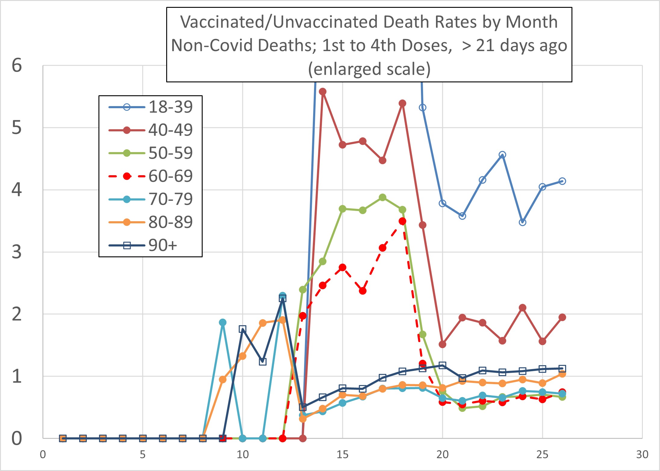
Figure 1 plots the ratio of vaccinated/unvaccinated death rates against month, from April 2021 (month 1) to May 2023 (month 26) for Non-Covid Deaths and for “First dose, at least 21 days ago”. Figures 2, 3 and 4 are the same for “Second dose, at least 21 days ago”, “Third dose or booster, at least 21 days ago” and “Fourth dose or booster, at least 21 days ago”. (Figures 4a and 4b differ only as regards the y axis scale).
The most obvious feature is that much of the data for the vaccinated/unvaccinated death rate ratio lies above 1, indicating that the death rate amongst the vaccinated exceeded that amongst the unvaccinated in those cases. It is important to note that this compares like with like in that the ratio relates to two quantities which both refer to people in the same age range.
Figure 1
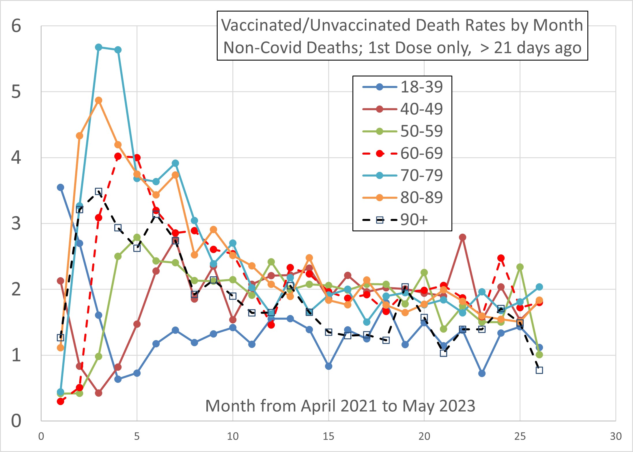
Figure 2
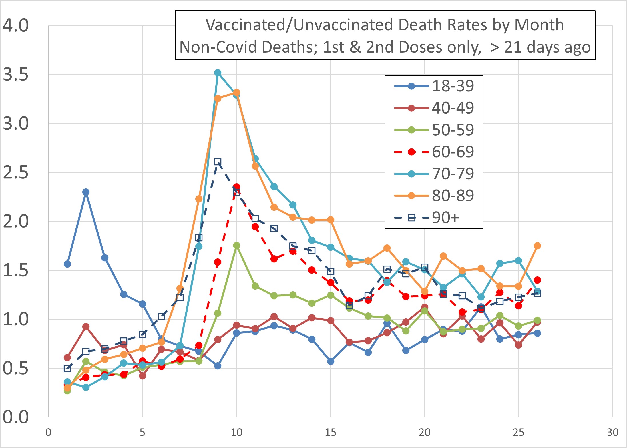
Figure3
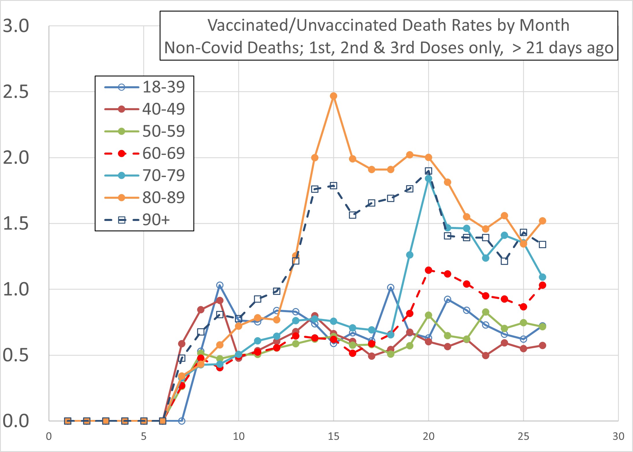
Figure 4a
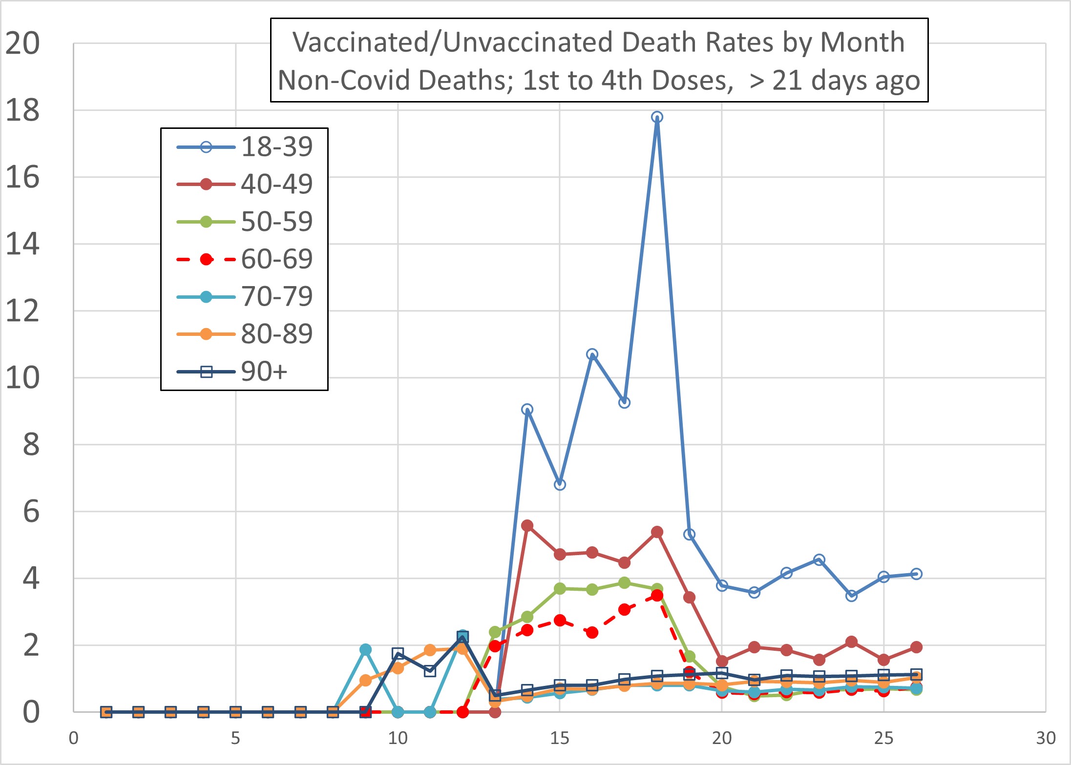
Figure 4b
Tentative Interpretation of Figures 1 to 4
I offer an interpretation of Figures 1 to 4, noting that this is speculative not definitive.
Figure 1 shows peaks in the death rate ratio in the oldest age ranges (≥70) in June 2021. In the age ranges 60-69, 50-59 and 40-49 the peaks move to successively later months (July, August and October respectively). If one makes the hypothesis that the vaccines have had a harmful effect, leading to death in some cases, then this would be expected. The first doses of vaccine were received between December’20, for the oldest ages, to March’21 for the 40-49 age range. The staggering of the peak ratios by about 4 months can then be attributed to the staggering of the vaccinations by a similar number of months. If this view is correct, it suggests a time delay between vaccination and consequent death of about 6 to 7 months, as regards the peak in death rate, though Figure 1 suggests the effect could be sustained for years.
At the risk of stating the obvious, those who have died following one dose of vaccine will not feature in the statistics for the second dose or thereafter. Because these, apparently more vulnerable people, are missing from the second dose data, the death rate ratio in Figure 2 starts initially below 1. However, by December 2021 the ratio has reached a peak in the older age groups (70+). The second dose vaccination campaigns for those aged 70 and above was from about March to May 2021. So again the peak in death rate ratio occurs about 7 to 9 months after vaccination. For those aged 50-69 the peak is the following month, January 2022, a delay of about 8 months.
Figure 3 continues this trend. The third dose campaign started in October/November’21 for the oldest people, as indicated in Figure 3 (October’21 = month 7). For the first 6 months after this third vaccination the death rate ratio lies below 1, presumably for the same reason as described above – the culling of the vulnerable by the previous campaigns (as well as people who have suffered non-fatal ill effects from the previous vaccinations being dissuaded from taking the third dose). However, the death rate ratio again peaks for the oldest people (80+) about 8 months after vaccination, in June’22. (The 70-79 age range bucks the trend with a delay to peak ratio of 12 months, to November’22).
Figure 4a (and 4b on a larger scale) plot the death rate ratio after the 4th dose. The most important thing to emphasise is that the sharp peaks seen in the ratio for the younger age ranges is nothing to do with the 4th dose. The 50 to 69 year olds received their 4th dose in November/December’22 (months 20 and 21), which is beyond the peaks in Figures 4. Moreover, those younger than 50 have not, even by May’23, had a large take-up of a 4th dose (though, clearly, some have had a 4th dose). The peaks in Figures 4 relate, not to the 4th dose, but to the 3rd dose…whose effect was delayed in some cases long enough to appear only after a 4th dose was received. People in the age range 18 to 49 received a 3rd dose in December’21 or Januay’22, and the corresponding peaks in Figures 4 are 8 or 9 months later in September’22 (month 18).
To emphasise: if this interpretation is correct, the data to May’23, as given by the current dataset and used to plot Figures 1 to 4, does not yet include the potentially fatal consequences of the 4th vaccination campaign, at least for people under 70 who received their 4th dose only in November/December’22, or later. If the above interpretation is valid, the fatal effects of the 4th vaccination campaign would not be seen in the data, at least for those under 70, until June to August’23, just beyond the current dataset.
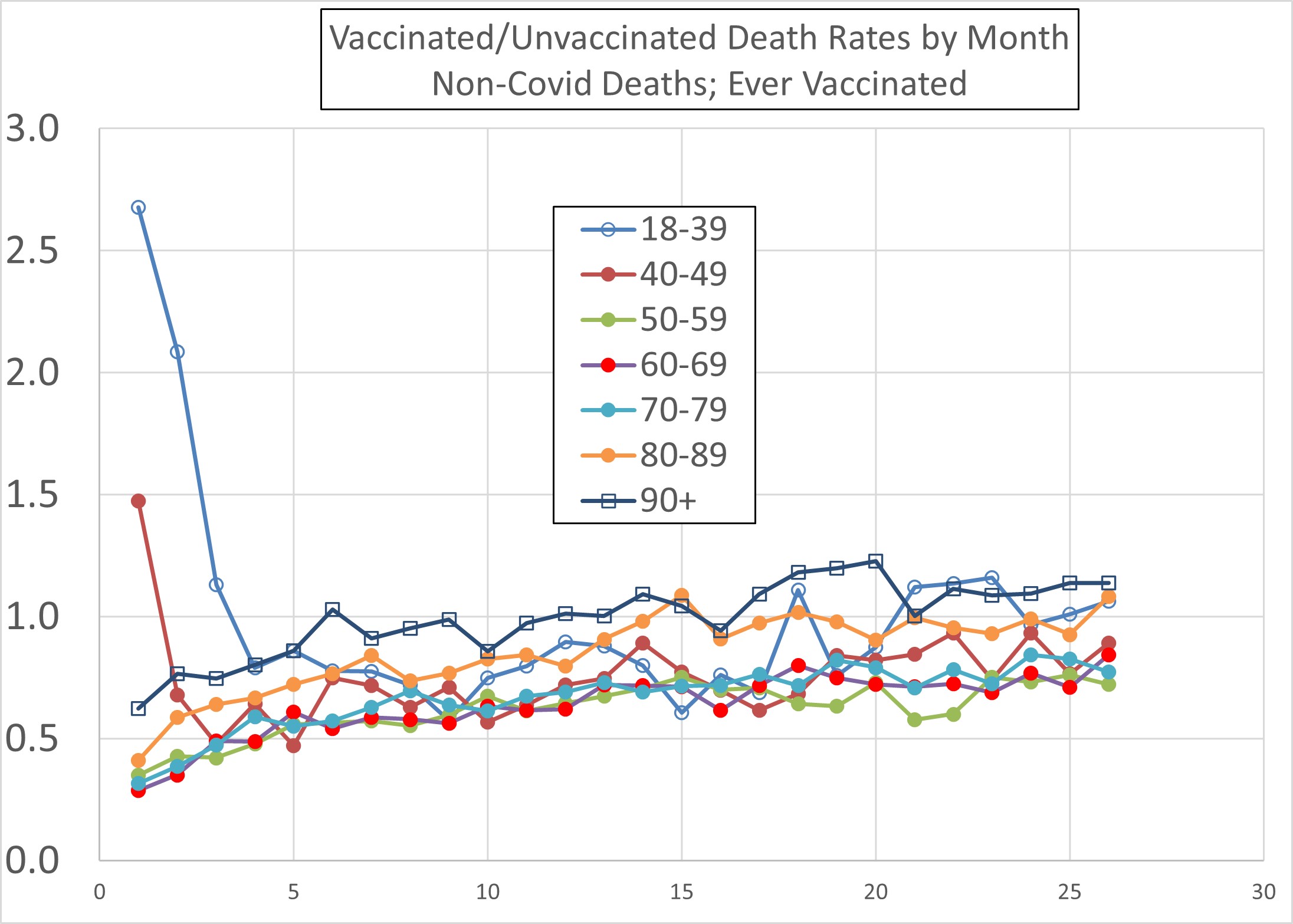
“Ever Vaccinated” Death Rate Ratio
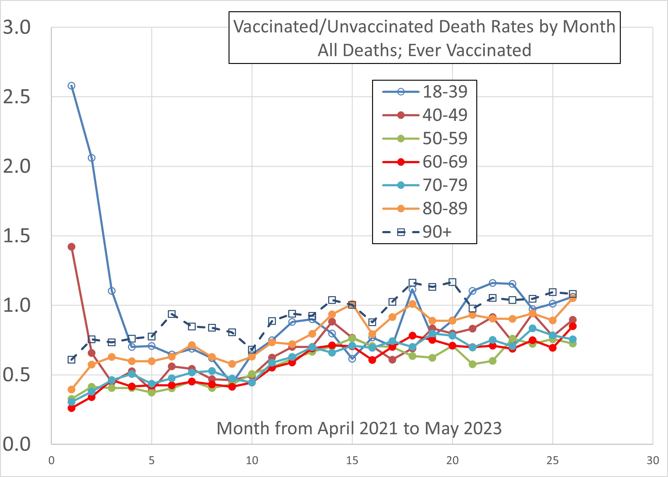
BUT the current position might not be quite so bleak as Figures 1- 4 suggest. Figure 5 plots the vaccinated/unvaccinated death rate ratio for those ever vaccinated. At first glance Figure 5 seems to confound the above interpretation, showing a vaccinated/unvaccinated death rate ratio predominantly below 1. How can this be arithmetically consistent with Figures 1 to 4? It comes about because there are data in Figures 1 to 4 close to or below 1, and these are hugely dominant in terms of the corresponding populations. Consequently, Figure 5 obscures the details which emerge when plotting in the form of Figures 1 to 4, much of which data relate to small minority sub-populations.
In fact there is a possibility that the rather alarmingly high ratios seen in Figures 1 to 4b are the result of a sample bias effect. Consider those people who have had one dose of vaccine but no more. Why? It is likely that a disproportionate number of these people self-select on the basis of having had an adverse reaction of some sort to the first dose (including, most obviously, those who die). Hence, the “first dose only” contingent might be expected to be skewed to higher death rates than average. The same effect works through each subsequent dose where people have ceased to accept the jab before the 4th dose.
It is worth bearing in mind that, in respect of the total numbers of deaths, it is the oldest age groups which strongly dominate, and it is those aged 80+ whose death rate ratio in Figure 5 is in excess of 1, or close to 1, from week 14 (May’22). It may not be coincidence that May’22 was when Non-Covid excess deaths became positive and have remained positive virtually every week since (see here).
However, the more significant feature of Figure 5 is the upward trend (for all ages). From the perspective of the foregoing tentative interpretation, this upward trend would arise from the roughly 8 month delay in the (peak) fatal effects of vaccination.
Recall also that the current dataset probably does not yet include the potentially fatal effects of the 4th vaccination campaign for most people due to the 8 month delay. The implication is that the upward trend seen in Figure 5 is predicted (by this interpretation) to continue at least over the months June to September 2023. But with the 5th vaccination campaign now being rolled out to those aged 65 and over, the upward trend of Figure 5 would be predicted to continue in these age groups up to summer 2024.
Figure 5
Death Rates from All Deaths
Figures 6 to 9b are the equivalent of Figures 1 to 4b but for “all deaths”. Similarly, Figure 10 is the equivalent of Figure 5 for “all deaths”. The two sets of Figures are qualitatively very similar and do not provide any new interpretational issues.
Figure 6
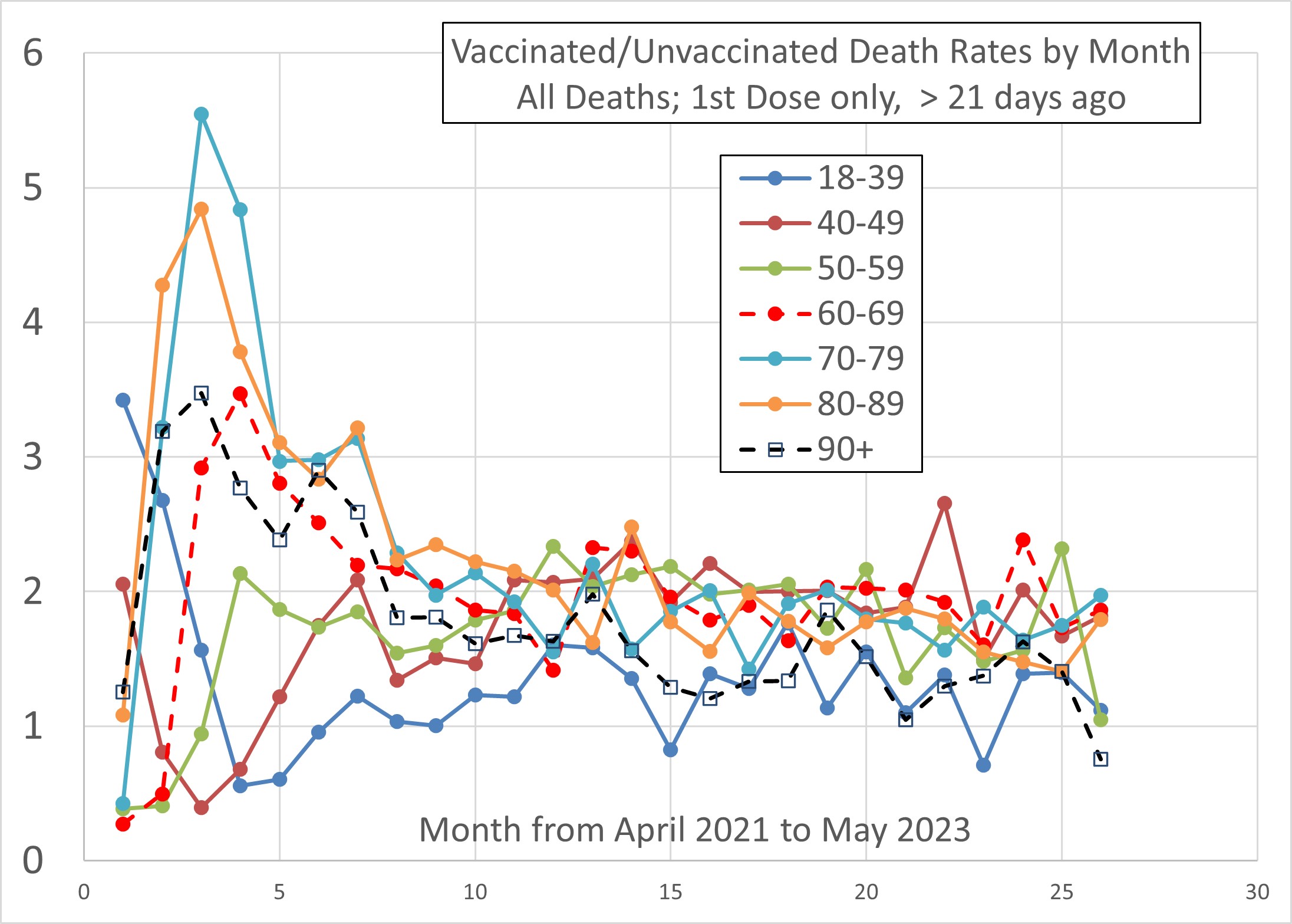
Figure 7
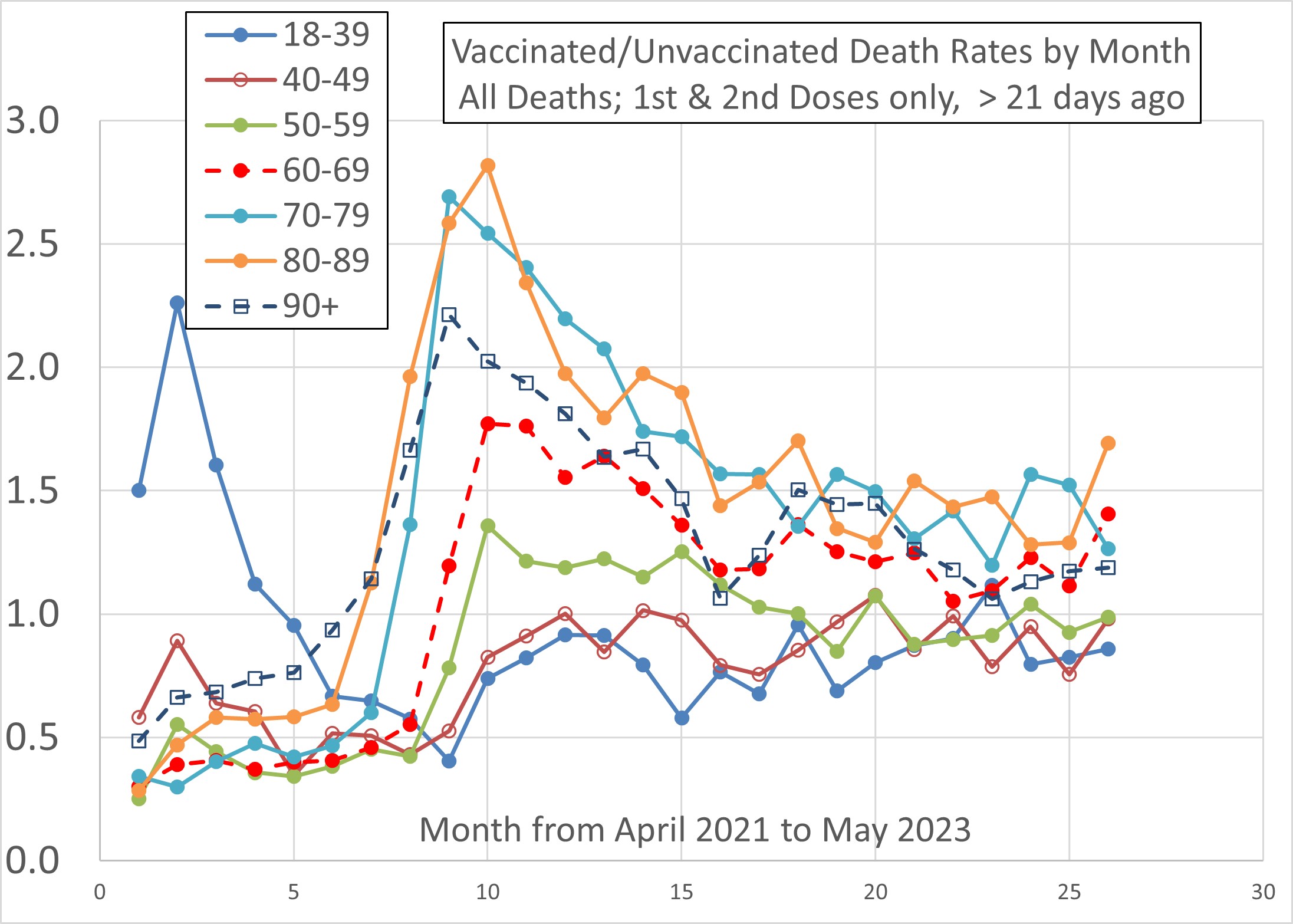
Figure 8
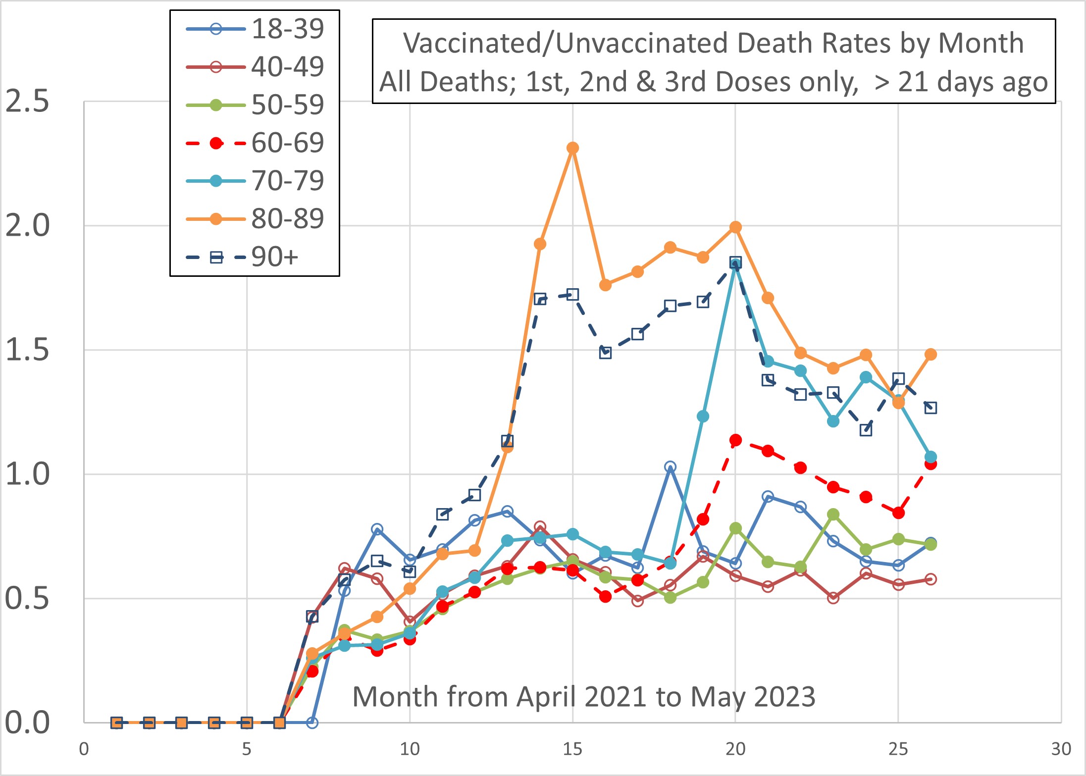
Figure 9a
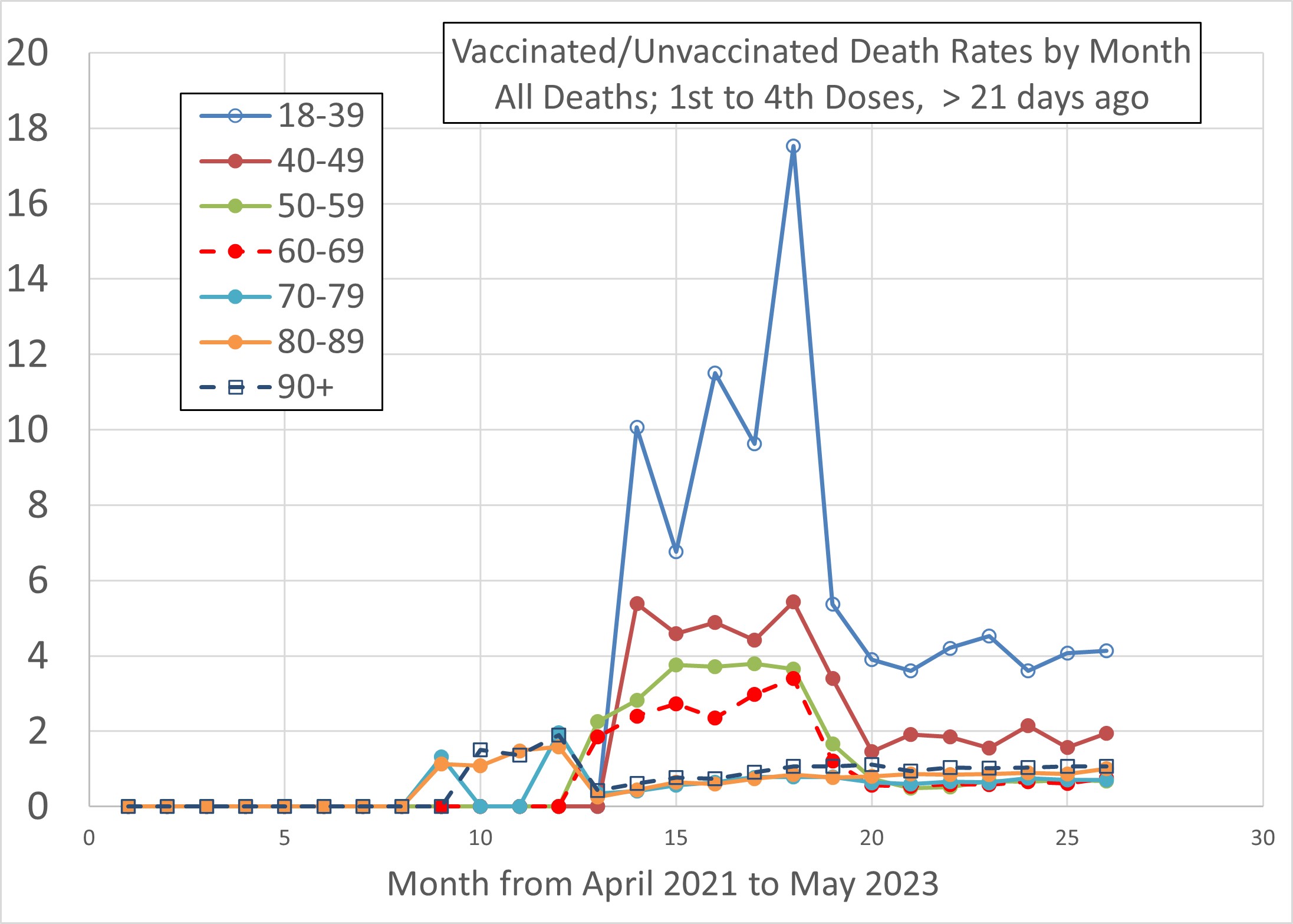
Figure 9b
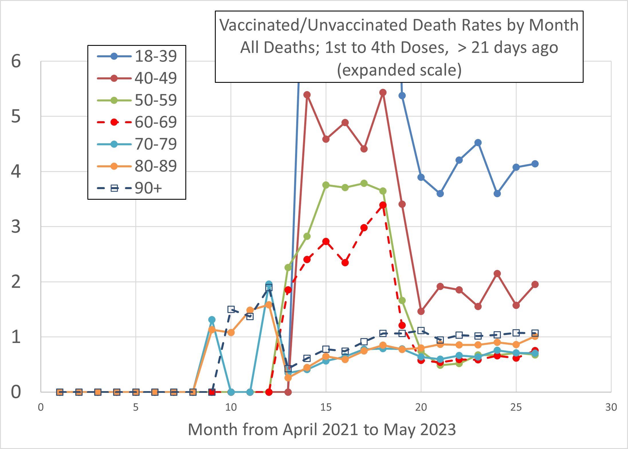
Figure 10
Confidence Limits
I have not addressed confidence limits here. I will do so if there is sufficient interest, but I’m currently out of time.
Critique of the ONS Analysis / Interpretation
Age Standardisation
The ONS use death rates adjusted by Age Standardisation. This procedure (explained in detail here) requires death rates to be calculated in a number of age bands, with each such death rate then being factored by the proportion of that age band in a so-called European Standard Population (ESP). If your population age bands were in fixed proportion to the ESP, this would make no difference to the result. But otherwise, it does.
The purpose of Age Standardisation is to permit death rate statistics (or, indeed, any other social measures) to be made comparable between different nations. It would clearly not be reasonable to compare crude death rates if one nation had a larger proportion of older people than the other. Age Standardisation is intended to correct for this. For example, if you wished to compare the English death rate “involving Covid” with that of another nation, then Age Standardisation might well be a sensible procedure to deploy – specifically for the purposes of that comparison.
However, it is not sensible to use ESP Age Standardised death rates when the objective is (as here) to compare vaccinated and unvaccinated populations. There is, of course, still an issue of overcoming the problem of comparing two populations (one vaccinated and one not, in this case) which have different age distributions. As with comparing nations, it would not be sensible to use crude death rates to perform this comparison if the populations in question had different age distributions. This will indeed be the case for the vaccinated and unvaccinated populations if the age range covered was very broad, e.g., everyone aged 18 and over. Nevertheless, the introduction of a Euro-standard age distribution seems more of a confusion than an assistance.
Most importantly, the Age Standardised death rates that are produced by this process bear little resemblance to actual death rates when populations covering a large spread of ages are in question (e.g., everyone over 17 or everyone over 9). What the procedure then does is to factor down the contribution from the oldest age groups, in which the bulk of the deaths occur. I would regard this as corrupting the signal.
In any case, there is no need to agonise over the matter. The problem can easily be side-stepped by using only the age-specific data from Table 2 of the dataset. These age bands are sufficiently narrow that age variation effects within them can reasonably be neglected. We can then work, as I have done above, simply with the “crude”, i.e., the actual, death rates.
The ONS Claim
The ONS makes claims in respect of deaths involving Covid-19 on the basis of Age Standardised rates, which I regard as suspect for that reason (see above).
In respect of Non-Covid deaths, the ONS claim,
- Non-COVID-19 mortality rates are similar, though slightly lower, in people who have had a third dose or booster compared with unvaccinated people in the latter half of 2022 and in 2023.
- Non-COVID-19 mortality rates for first and second doses are more likely to be affected by confounding factors in the latter half of 2022 and in 2023 as these are people who did not receive a booster when eligible and therefore may differ from the general population.
The basis of the first of these statements is obscure, to put it mildly, even using the ONS’s own figures. The following Table presents, for all ages from 18 onwards, the vaccinated/unvaccinated death rate ratios over “the latter half of 2022 and in 2023”, both with and without Age Standardisation (the former using the ONS’s own data from their Table 1), and for “third dose or booster more than 21 days ago”. The ratios are all greater than 1, the opposite of what ONS claim.
| Month | Age Standardised Death Rate Ratio (Vax’d/Unvax’d) | “Crude” Death Rate Ratio (Vax’d/Unvax’d) |
| May’23 | 1.24 | 1.86 |
| Apr’23 | 1.27 | 1.84 |
| Mar’23 | 1.30 | 1.88 |
| Feb’23 | 1.28 | 1.86 |
| Jan’23 | 1.37 | 1.95 |
| Dec’22 | 1.46 | 2.08 |
| Nov’22 | 1.75 | 2.59 |
| Oct’22 | 1.53 | 2.68 |
| Sep’22 | 1.32 | 2.65 |
| Aug’22 | 1.32 | 2.66 |
| Jul’22 | 1.34 | 2.75 |
As for the second statement, it appears to be an excuse not to mention the relative death rates for people who received only one or two doses. I note that the all-ages death rate ratios for the first and second doses are, like Table 1, again greater than 1, whether age standarised or not. The claim that such people, who did not receive a booster when eligible, “therefore may differ from the general population” is true. But one of the ways in which they will probably differ is by having had an off-putting adverse experience from the previous vaccinations, including death.
Conclusions
- Figures 1 to 4b and Figures 6 to 9b give reason for concern, although the large death rate ratios might be attributable to a sample bias effect. The peak fatal effects of vaccination, if the tentative interpretation is correct, appear to be delayed by about 8 months, though the effects can persist for far longer.
- This concern is allayed somewhat by Figures 5 and 10. But if the upward trend seen in these Figures continues (as I predict) then these Figures will also become very concerning by summer 2024.
- The ONS’s comforting words about Non-Covid death rates appear to be without foundation in their own data.
- A debate in Parliament on excess deaths has finally been granted to MP Andrew Bridgen on Friday 20th October. It will be interesting to witness the concern of our parliamentarians and government as will no doubt be manifest by a full house and lively contributions from many other MPs.