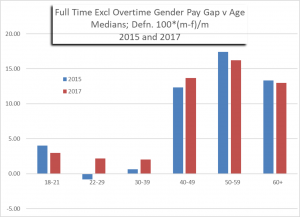
Added: 1/1/18: This post has been revised, and the above graphic replaced, following the ONS declaring the original graphic posted here was in error. The background to their blunder is explained here. (Click on graphic to enlarge)
I have never done a post on the (groan) pay gap. It’s about time, I guess. No, don’t worry. I’m not going to re-iterate for the billionth time the reasons why men earn more on average than women. We all know why – even the feminists. Sure, feminists will claim it’s because “women get paid less for the same work”. But only the very silly foot soldiers actually believe this. The serious feminists – the really dangerous ones – know full well that the main reason is that men are more work focussed than women, whereas women generally prioritise ‘work life balance’, i.e., a balance of the domestic and paid work. Most of us sane people have no problem with that, always bearing in mind that general tendencies do not undermine individual opportunity – i.e., some people choose to depart from the norm and should be free to do so. Unfortunately the feminist lobby believes that people’s free choice should be re-engineered to align with their ideology, promoting the perspective that any overall pay gap must be a sign of male oppression of women – as opposed to male contribution to society in terms of effort.
The reasons for higher male earnings have been laid out clearly in Warren Farrell’s book Why Men Earn More and in the videos by Christina Hoff Sommers and Warren Farrell, or see any number of sources, e.g., here or here . In brief, the main reason is that men work more hours. They also work more continuous full time years, without career breaks. The underlying reason behind men’s greater working hours and working years is that women, past a certain age, prioritise domestic and childcare matters, whilst men increasingly prioritise earnings in pursuance of the same objective – support of the family. Men’s prioritising of earnings comes at a cost, namely reduced work-life balance. Thus, if faced with an option to increase his pay by taking on a job which is unpleasant, laborious, or dangerous, or involves long commutes or working away from home, men are far more likely to take up the option than women. Men are also more likely to put in overtime when they would prefer not to, in order to enhance promotion prospects. It all comes down to the degree of work-centeredness, which Catherine Hakim has observed is far stronger in men.
Hourly Pay Rates
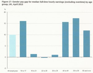
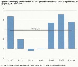
However, we can cut through all that. The killer graphic is the median hourly pay rate, excluding overtime, for full time workers against age and gender. Figure 1 is exactly that, taken from the ONS “annual survey of hours and earnings 2013”. [The pay gap is defined as (m – w) / m as a percentage]. Figure 2 is the corresponding histogram for 2014. Both are available here. The salient fact is that there is virtually no gender pay gap for people in their twenties and thirties. It’s strange the way the patriarchy selects older women for oppression.
Figure 1: From ONS Annual Survey of Hours and Earnings (2013) click to enlarge
Figure 2: From ONS Annual Survey of Hours and Earnings (2014)
The 2015 ONS Annual Survey of Hours and Earnings does not include the corresponding histogram, nor do the equivalents for 2016 and 2017. However, the data to plot one’s own histogram can be found here. The result, for years 2015 and 2017, is shown in Figure 3 (and also heads this revised post).
Figure 3: From ONS Annual Survey of Hours and Earnings (2015 and 2017) – Click to enlarge
In Figures 1, 2 and 3 the data for ages 16-17 relates to only a very small number of people. The data for the 18 to 21 age group is for non-graduates, and the (small) pay gap in favour of males reflects this.
The salient feature of Figures 1, 2 and 3 is that there is essentially no pay gap in the age range 22 to 39 (gaps of less than about 2% are probably within the noise of the data). This is the key fact that everyone who cares to talk about the pay gap should know.
Much has been said about men’s greater earnings being due to their tendency to enter better paid professions. We can see now, without the need for detailed analysis, that this is untrue. By age 39, most graduates will have been working for more than 15 years. The effect of their chosen profession will be evident in earnings data prior to age 39. But there is no gender pay gap for full time workers below the age of 39. So, whilst it may be true that some, educationally successful, men enter particularly well paid professions, this is not evident in the mean. There must be other men doing less well than women.
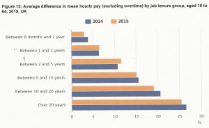
ONS data shows that the longer a person stays in a given job, the higher the hourly pay rate becomes, see Figure 4. Men are in their forties before they realise this advantage, after perhaps 20 years or more of full time work. Men older than 40 are, on average, paid more than women because they have, by then, put in more continuous years of work, and worked more hours per year, than women of the same age. And, yes, that means a tendency for more men in senior positions. That is what the feminist lobby interpret as bias against women, and are increasing ‘fighting’ in terms of requiring quotas for women – overall and in senior positions particularly.
Figure 4: Effect of Years-in-Job on Hourly Pay Rate
Greater male earnings are presented in the media as male privilege. But it is clear that the greater earnings men eventually achieve is actually due to decades of effort. This is not to suggest that women are putting in any less effort – but less of their effort is directed towards paid employment.
It will be interesting to see if women’s superior educational attainment compared to men leads, over the next decade or two, to a pay gap in favour of young women in the age range 22 to 39. There are reasons to believe that the educational disadvantage to boys and young men is systemic (e.g., see here and here and here and here and here and here and here) a matter which is already causing concern in quarters not contaminated by feminism.
Possibly the greatest threat to our economy is the potential that social movements have to undermine male striving. It is known that male effort in terms of hours worked increases on marriage / childbirth. With the decline of both these things, a diminishing of male effort is to be expected. But the government, and opinion formers generally, appear to be oblivious of this threat to the economy. The government is locked into a mindset that ‘”what’s good for women’s employment is good for the economy”. With men contributing 72.7% of income tax revenue into the exchequer, blithely ignoring the challenge to male employment due to both educational failure and adverse social pressures must ultimately come forcibly to government attention as the economy suffers or as the swelling ranks of the unemployable male underclass gives rise to serious civil unrest.
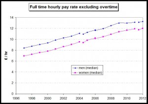
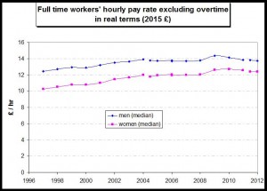
The actual median hourly pay rates for full time workers of all ages can be obtained from the ONS report “Patterns of Pay: Results from the Annual Survey of Hours and Earnings, 1997 to 2012“. I have plotted these against year in Figure 5. Figure 6 shows the same data converted to real terms using 2015 £ (conversion using CPI).
Figure 5: Full time hourly pay rates across all ages
Figure 6: Full time hourly pay rates across all ages (real terms)
Women part time workers of all ages are paid more per hour than men
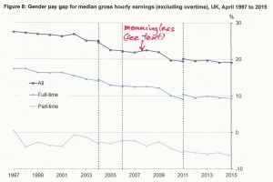
The median gender pay gap across all ages is shown against year, from 1997 to 2015, in Figure 7 for both full time and part time workers (taken from the 2015 ONS Annual Survey of Hours and Earnings). For full time workers it has reduced from 17.4% to 9.6% over this period.
Do not give any credence to figures closer to 20% which are bandied around in the press – see below.
For part time workers, women have earned more per hour than men for the last 18 years. The part time working gender pay gap in favour of women now stands at 7%. The part-time pay gap in favour of women is increasing, in contrast to the full-time pay gap in favour of men which is decreasing.
NB: Part-time work is defined as employees working not more than 30 paid hours per week (or less than 25 hours for the teaching professions).
The uppermost line on Figure 7 is meaningless. Ostensibly it applies to “all workers”, i.e., both full time and part time. But since the gender pay gaps for full time and part time working in 2015 were 9.6% and -7% respectively, it is clearly bonkers to suppose that a figure of nearly 20% applies for all workers. What this uppermost data actually reflects is the fact that the hourly rate for full time workers (of both sexes) considerably exceeds the hourly rate for part time workers (of both sexes). Because far more women work part time, averaging over all workers inevitably makes the (apparent) gender pay gap look to be large and in men’s favour. But the uppermost line in Figure 7 really just reflects the premium anyone (of either sex) gets for working full time. It is not a gender pay gap for equivalent working at all. It is statistical legerdemain. I’m surprised the ONS thought it appropriate to include it.
Figure 7: Gender pay gap over all ages showing the reducing full time pay gap and the increasing part time pay gap in favour of women (click to enlarge)
Public Versus Private Employment
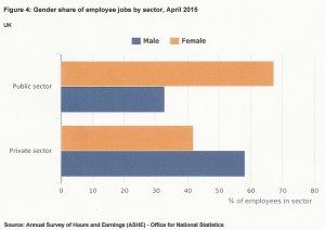
Over twice as many women as men are employed in the public sector (due primarily to education and health), see Figure 8. Conversely, men dominate in the private sector.
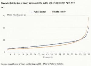
However, as of April 2015, hourly pay rates in the private sector were lower than those in the public sector for 90% of staff, see Figure 9. Only in the upper decile do private sector pay rates exceed the public sector.
Putting together the above two statements implies that, if men and women were equally distributed in seniority (i.e., in pay grade) then women would, on average, be paid more per hour by virtue of dominating in the public sector. That men still command a greater hourly pay rate, when taken across all ages, can only be due to more men than women moving into the upper decile due to working more years and gaining seniority.
Figure 8:
Figure 9:
Hours Worked
The following working hours data are taken from ONS datafile Actual weekly hours of work: People (not seasonally adjusted) May 2016, and the equivalent at June 2014. Data are for the whole UK.
Average for year July 2013 to June 2014
- Number of men employed 15.64 million; number of women employed 13.55 million (includes full time and part time workers).
- Hours worked per week by men: 595.6 million
- Hours worked per week by women: 378.8 million
Table 1: Average hours worked per week per person (June 2014)
| (hours) | Full time | Part time | Second job |
| Men | 39.5 | 16.2 | 10.4 |
| Women | 34.4 | 16.0 | 8.7 |
Average for year April 2015 to March 2016
- Hours worked per week by men: 608.9 million
- Hours worked per week by women: 393.9 million
Table 2: Average hours worked per week per person (March 2016)
| (hours) | Full time | Part time | Second job |
| Men | 39.1 | 16.2 | 10.0 |
| Women | 34.0 | 16.2 | 9.0 |
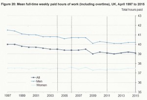
The trend in average hours worked per week since 1997 is shown in Figure 10. Whilst women’s average working hours have not changed, men’s have been trending down. This is not due to the 2008 recession. The trend started well before that. Whilst I have not definitively established the reason for the decline in men’s working hours, I note that it is what would be expected to accompany a reduction in marriage rates – because men tend to prioritise paid work even more when married.
If classical economics applied, the alternative explanation for men’s reducing working hours, namely that the demand for men’s labour has declined, would be ruled out. This is because a reduction in demand would be accompanied by a reduction in pay rate, but the real-terms pay rate is actually higher now than in 1997 (see Figure 6). However, it is possible that the operation of the minimum pay statute has subverted this reasoning so it is possible that the decline in men’s working hours is demand-side driven. (This would align with the conclusion for the USA in Wayward Sons).
Figure 10
The Gender Income Tax Gap
Men contribute 72.9% of income tax revenue, i.e., the gender income tax gap to men’s detriment is 166%. That makes the pay gap pale into insignificance, doesn’t it?
(If you don’t want to flog through the HMRC data yourself to derive that 72.9% figure its been laid out here for you).
A Pay Gap Tax?
The gross disproportion in income tax payment is not enough for the feminists. Nor are the above observations on the true nature of the pay gap – especially the fact that the pay gap does not exist for young women under 39. There is a growing movement to simply bump up women’s pay to that of men. All pretence of meritocracy or fairness is being abandoned. The University of Essex has recently given all its female professors a pay rise to make their average pay the same as that of the male professors. Age, years of experience, performance and contribution – all irrelevant.
The Director of a company, Brainlabs, Sophie Newton, has made a video promoting their adoption of a pay gap tax. At the end of the year, the average pay of men and women is worked out and, assuming the former is larger, the difference is presented to the women as a bonus. This will be done, Newton tells us, “regardless of performance or position”. When asked whether this discriminates against men, Newton replied with a smirk worthy of Jess Philips, claiming the move is justified because of the centuries of oppression. Oh really. This answers the obvious question – would men be the beneficiaries if women were paid more initially? No, of course not. If this initiative catches on we can anticipate young women looking to join companies which are top-heavy with older, senior men – the ultimate free ride.
And in Australia, the bank ANZ is putting an extra $500 per year into female staff’s superannuation pot. Same reward for the same work? Nope, it isn’t.
I wonder what would happen in any of the above institutions if a biological male claimed to identify as female in gender? I think we know. His/her claim to the female-bonus would be declined – because if they gave it to him, suddenly every man would be identifying as female – and there would no longer be a bonus to be had! Oops – the gender gibberish would stand revealed as subterfuge – only the possession of female genitalia counts.
It will be interesting to see if this type of flagrant unfairness becomes widespread. And if so, whether this, finally, will be enough to wake up the somnolent, bovine masses of men.
Employment and Unemployment
Data in this section are relative to the UK population of working age. This is defined as from 16 years old to state pension age (with due allowance for how that has changed in recent years). Three categories are used in national statistics: employed, unemployed and economically inactive. The ’employed’ category includes full time and part time workers.
People not working are classed as unemployed if they have been looking for work within the last four weeks and are able to start work within the next two weeks. There is no requirement to be claiming any form of benefit in order to be classed as unemployed.
Jobless people who have not been looking for work within the last four weeks or who are unable to start work within the next two weeks are classed as economically inactive. This category includes people who have retired prior to state pension age as well as people simply not wishing to work, e.g., those favouring full time domestic duties.
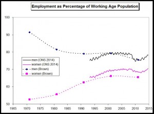
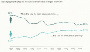
Belinda Brown in “Reviewing gendered employment policies” (2014) has observed that whilst the government strategy of encouraging increasing female employment has been successful, it has the unfortunate effect of reducing male employment. There is no doubt that this is true of employment rate, defined as the percentage of the working age population who are employed. Brown’s data, from 1971 to 2011 (referenced as being from here), is reproduced in graphical form in Figure 11, in comparison with data from the ONS Labour Force Survey datasets, “participation in employment in UK 1993 to 2014”.
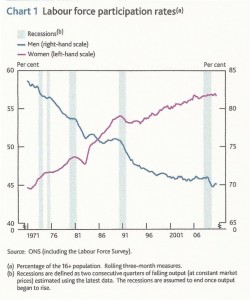
Figure 11 may be compared with Figure 12, ultimately from the same source (the ONS Labour Force Survey) but Figure 12 normalises the data by the whole population aged 16 and over, not just the working age population. Finally, Figure 13 confirms Figure 11.
The striking thing about the employment data is that the male employment rate has reduced by almost the same as the female employment rate has increased (roughly 14% to 16%). I stress this is in terms of employment rate, which is a percentage of the working age population. Because the working age population has increased, the change in absolute numbers of people employed is different. I estimate that the number of employed men has reduced by about 8% since 1971, whereas the number of employed women has increased by about 40%. The benefit to the economy, in terms of increased GDP due to a larger employed workforce, would appear to depend upon an increasing population. Conversely, increasing female participation in the workplace does not, in itself, increase economic activity. And yet this appears to be the driver behind the endless initiatives to improve female academic performance, increase female representation on Boards, increase women-in-STEM, etc. etc.
The government really does seem to believe in the economic magic of getting more women into paid work. Nicky Morgan, for example, has claimed that,
“Equalising women’s productivity and employment to the same level as men’s could add almost £600 billion to our economy, clearing a third of our national debt”
It doesn’t give one much confidence in the government that a Minister can make such a moronic statement. This is the employment version of fiat money, is it? Fiat GDP? We’d be better off with Mr Bean in charge.
Figure 11: Employment rate against year (Brown & ONS data)
Figure 12: Employment rate against year (ONS data), normalised using the whole population aged 16+
Figure 13: Employment rate against year (unknown provenance)
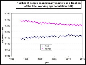
The flip side of employment are the economically inactive people. Figure 14 shows the number of inactive people as a proportion of the working age population from 1993 to 2015. The number of inactive women was double the number of inactive men in 1993. By 2015 the number of inactive women had become only 50% greater than the number of inactive men.
Figure 14
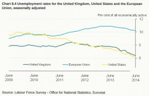
And finally…since the EU Referendum is just 12 days away, here’s yet another reason to vote Brexit – Figure 15.
Figure 15
Prognosis
The government, like the rest of society, is in the grip of a feminist enchantment. They believe that economic salvation lies in increasing female employment. The main engine of the economy continues to be male effort, just as it ever was. But in the name of female empowerment our society is content to let boys and young men flounder, both in terms of education and in terms of the perpetually greater threat to employment in male dominated areas of work. This twin threat is amplified by societal pressures to assist women in employment without regard to its impact on men. By the time that these disadvantages to males have unambiguously impacted the economy it will be too late to enact immediate rectification. A two decade time lag, at least, must ensue. But the worst case scenario is that, by then, men will have ceased to be interested in being an economic engine at all.
